Below you will find pages that utilize the taxonomy term “Ericfischer”
December 30, 2011
Transit to Everywhere
![]() Data courtesy MapQuest and OpenStreetMap CC-BY-SA, the City and County of San Francisco, and Bay Area Rapid Transit
Data courtesy MapQuest and OpenStreetMap CC-BY-SA, the City and County of San Francisco, and Bay Area Rapid Transit
This is an overlay of the transit and walking trip plans generated by OpenTripPlanner from Powell and Market to every other intersection in San Francisco, after Eric Fischer’s map of walking routes to every intersection in San Francisco. It brings out the transit routes but also shows well-used walking routes. The lines do not vary in width (don’t let Market Street fool you, it’s actually several lines—BART, MUNI rail in 2 directions, Muni bus, walking—very near each other). The lines fade where there are fewer routes using them, because they are rendered as black set at 10% opacity. Where there are more lines overlapping, the lines become darker, in what I believe is a log (or log-like) scale. It ended up just mostly being a map of San Francisco, with transit routes emphasized. It doesn’t show potential utilization of the transit system, because the routes are not weighted (it would probably be wise to weight the routes by the density of the block they terminate in and by their service area; i.e., estimate the number of people within the Thiessen polygon of each intersection and weight the route by that). Also, I had difficulty finding an opacity level where the usage of transit routes fades towards the end (as it clearly should) but still shows the streets that walked down by just one or two trip plans.
November 12, 2011
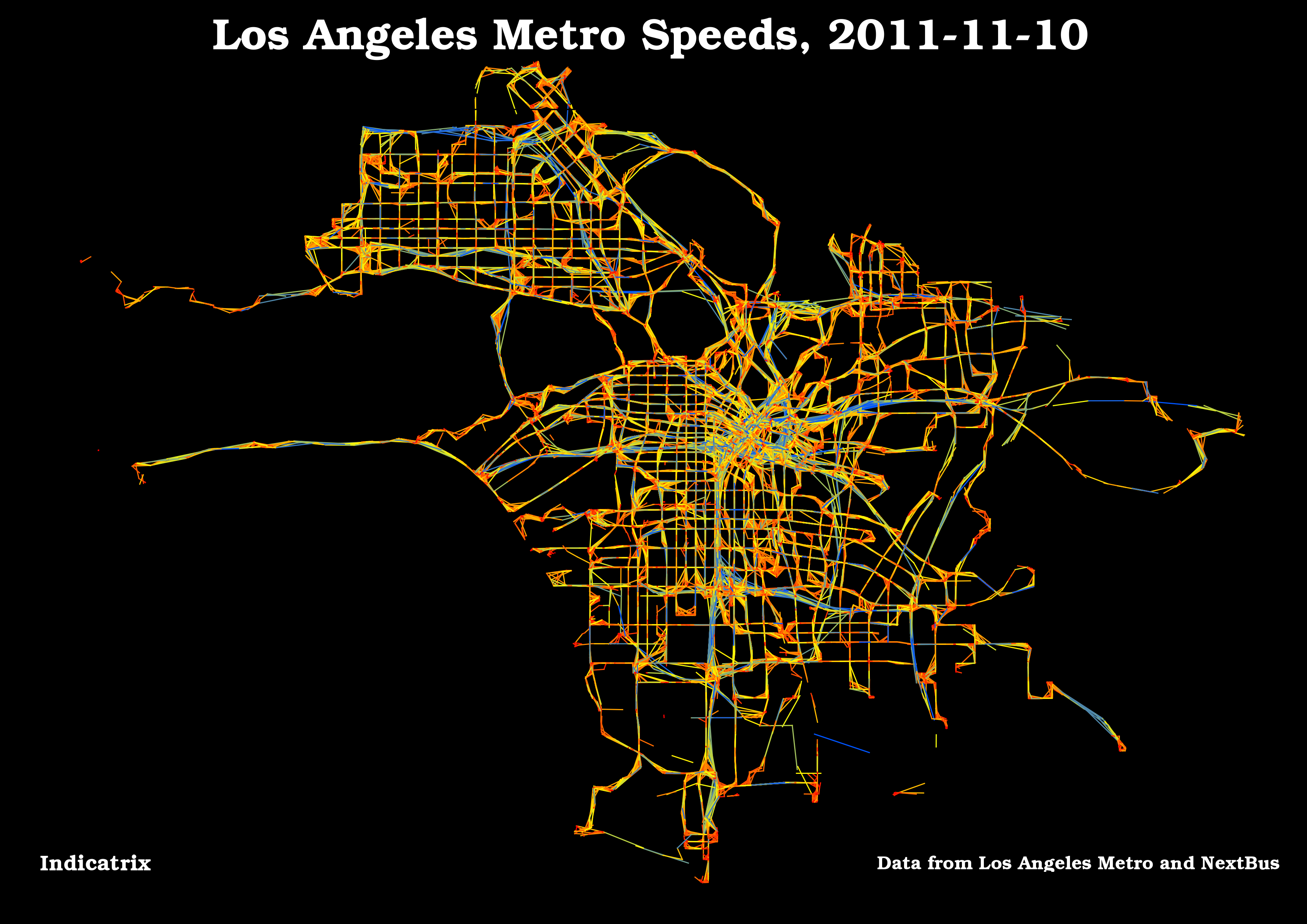
Another LA Metro Visualization
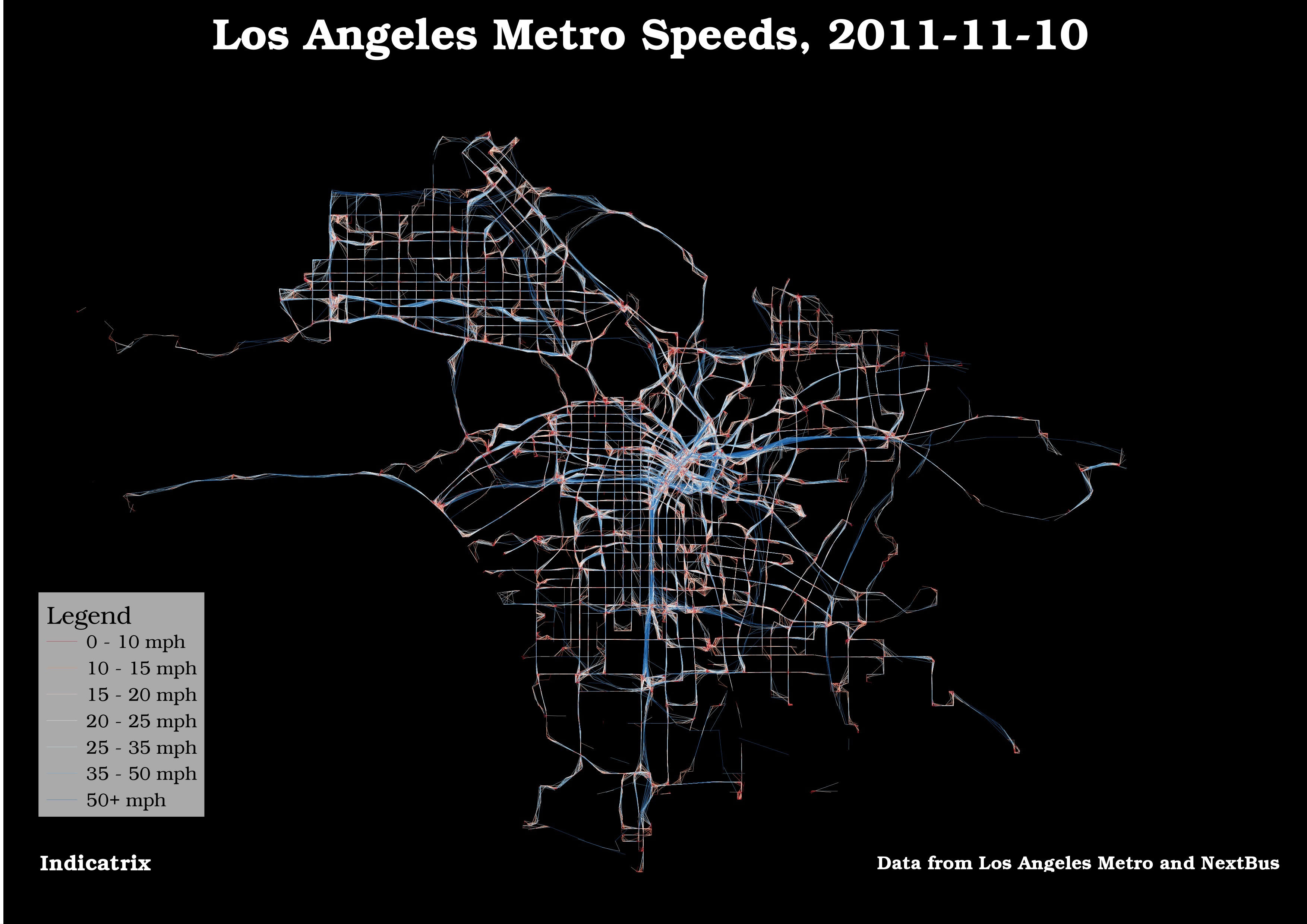
Here’s another visualization of the data used in the previous post; I made the lines a lot finer, so the noise is less visible. It’s easier than ever to see the Silver Line. I classed the data manually this time.
November 12, 2011
Making Transit Travel Speed Maps with Open Source GIS
Update 2011-11-12 8:21 -0800: I just posted a visualization I like better.
The Internet has been abuzz the past week regarding transit speed maps. It seems to have been spurred by a post on Bostongraphy, which was inspired by many of the amazing visualizations produced by Eric Fischer, especially this one. Indeed, this blog has gotten a fair bit of traffic itself, because Andy Woodruff of Bostonography used my avl2postgis project to retrieve the data.