Making Transit Travel Speed Maps with Open Source GIS
mattwigway
Update 2011-11-12 8:21 -0800: I just posted a visualization I like better.
The Internet has been abuzz the past week regarding transit speed maps. It seems to have been spurred by a post on Bostongraphy, which was inspired by many of the amazing visualizations produced by Eric Fischer, especially this one. Indeed, this blog has gotten a fair bit of traffic itself, because Andy Woodruff of Bostonography used my avl2postgis project to retrieve the data.
Most people who have created these maps have used home-made solutions for the cartography, but I thought you should be able to do this with just stock SQL and QGIS. Using QGIS for the cartography allows you to bring in lots of useful tools, things like classification and ColorBrewer ramps.
The main trick is converting the point data that is retrieved from NextBus into line data for mapping (more about the cartographic considerations of line and point data below, for now I’ll focus on the technical aspects). After several tries, I figured out the spatial SQL to do this:
SELECT loc_a.oid, loc_a.vehicle, loc_a.route, loc_a.direction, transform(ST_MakeLine(loc_a.the_geom, loc_b.the_geom), 26945) AS the_geom,
	(ST_Length(transform(ST_MakeLine(loc_a.the_geom, loc_b.the_geom), 26945))/
	(EXTRACT(EPOCH FROM loc_b.time) - EXTRACT(EPOCH FROM loc_a.time))) *
	2.23693629 AS mph, loc_a.time AS starttime, loc_b.time AS endtime
  INTO acrt.lametrolines
  FROM
    (SELECT *, ROW_NUMBER() OVER (ORDER BY vehicle, time) AS num FROM acrt.nextbus) AS loc_a
    JOIN
    (SELECT *, ROW_NUMBER() OVER (ORDER BY vehicle, time) AS num FROM acrt.nextbus) AS loc_b
      ON (loc_a.vehicle = loc_b.vehicle AND
        loc_a.route = loc_b.route AND
        loc_a.direction = loc_b.direction AND
        (loc_a.num + 1) = loc_b.num)
 WHERE loc_a.time <> loc_b.time;
ALTER TABLE acrt.lametrolines ADD COLUMN traversal int2;
UPDATE acrt.lametrolines SET traversal = EXTRACT(EPOCH FROM endtime - starttime);
(if you’re not using a timestamp column for the time column in your table (older versions of avl2postgis recommended varchar(19), you’ll want to run this script to convert them to timestamp columns).
The trick here is the window function ROW_NUMBER, which allows us to relate each row to the next row from that same vehicle. You’ll want to change the spatial reference from EPSG:26945 (State Plane California Zone 5) to something that is appropriate to your region. If it uses a unit other than meters, you’ll want to also change the conversion factor (2.2 for m/s to mph).
I added the traversal column afterwards; you could also do it in the original query. I used the traversal column (which is the time between position reports) to filter out segments in QGIS that took more than 3 minutes, so that coarse data is removed. I also filtered out segments with mph > 80, since they are probably caused by GPS noise.
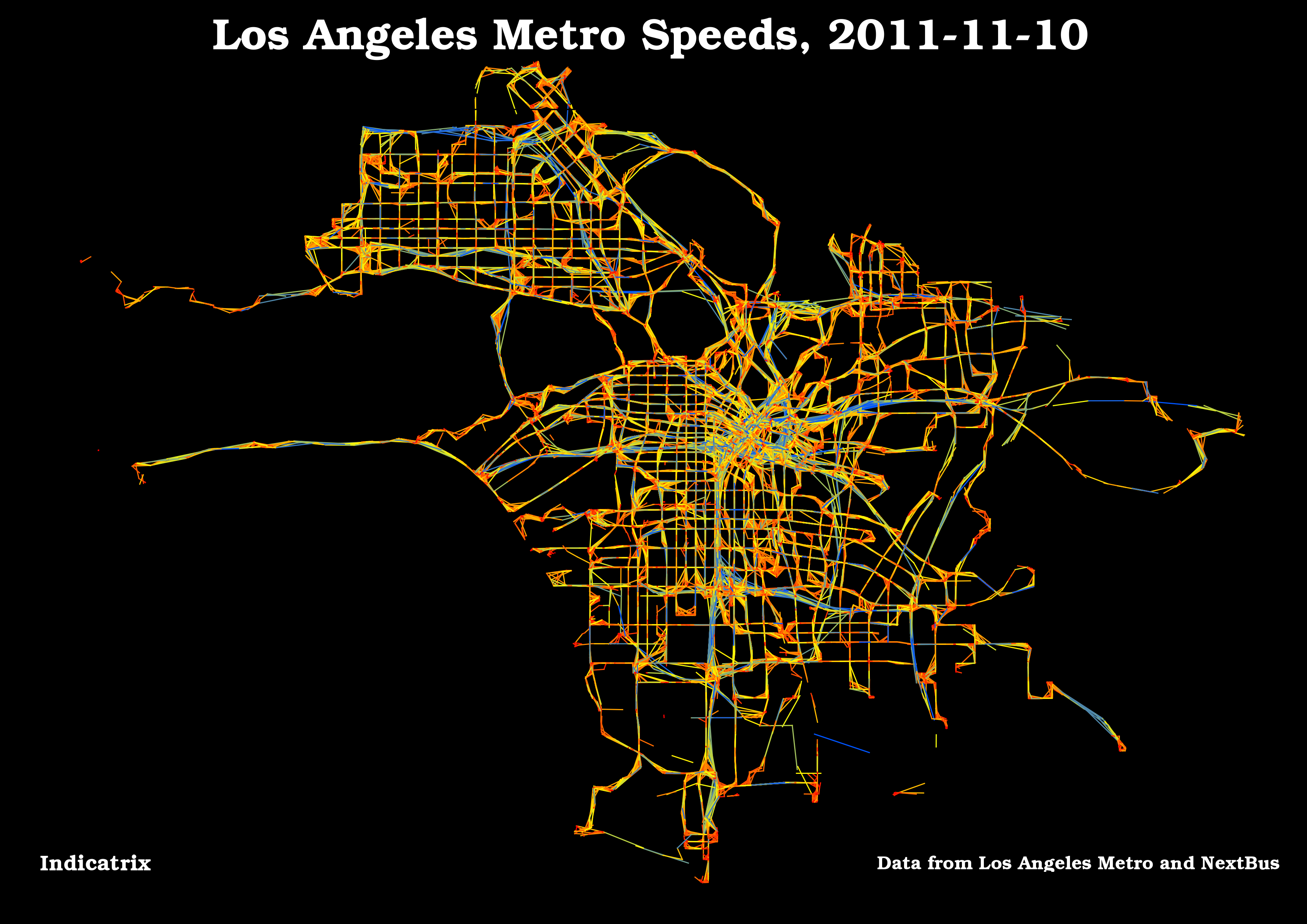
I created a view that sorted by traversal descending—I believe that causes the segments with the most frequent reporting to display on top. I messed with the symbology a lot to get the maximum amount of data to display; I ended up with 20 equal-interval stops between 0 and 80 mph, and a red-yellow-blue color ramp (admittedly lifted from the Bostonography post), with saturated red at 0 mph, bright yellow around 40 mph and blue at 80 mph. Most of the map is yellow-orange since it falls between 0 and 40 mph, and the degree of redness or yellowness indicates how slow or fast it is.
Comments or questions about how I did it or what the results were are more than welcome, either using the comments (preferably) or the contact link above.
I then symbolized based on the mph attribute. There are all kinds of things you can do with the symbology in QGIS—vary the ramps, the classification, and many other things. Also, since it’s just an SQL database, it would be trivial to make maps that showed, for instance, just Metro Rapid routes, &c.
The coolest thing about this map is how you can see the Orange Line (up north) and the Silver Line (extending east and south from downtown) as thick blue lines (hidden a bit by some of the other lines)—kudos to LA Metro for speeding bus service on these lines! I suspect the rail lines would show the same thing, but this map only shows bus service.
There are a few limitations that one should be aware of when using this map. One is that there are basically two classes of service for most agencies: slower, local-stop service, and fast express service (like the Silver and Orange line in this image); there isn’t much in between (there is Metro Rapid in LA, which somewhat bridges this gap). This means that most of any classification range won’t be used. I can’t wait to hear about innovative ways to solve this, but in the meantime the map still shows some neat things, and is also really pretty. In any case, I fiddled with the symbology a lot but wasn’t really happy with the results. I think a manually defined color ramp might be the way to go eventually, with detail around 10-25mph and less detail elsewhere. I didn’t want to change too much because I think one of the strongest things about this map is the amount of service above 40mph on the busways.
Another issue is drawing order. There are over 300,000 line segments in this map, so some of them draw on top of each other. Deciding which are more important is difficult; I displayed the shortest time segments on top so that the best detail would be emphasized.
A single line segment is drawn from each reported position to the next one. Positions are reported usually every 1-2 minutes, so if a bus is at a traffic light for a minute, that minute is 0 mph, while the next one might be cruising at 20 mph. A better way would be to have the speed averaged over several consecutive reports, if you were looking at specific lines, rather than chokepoints (to find chokepoints, you want the fine-grained data).
This map only shows buses, since LA doesn’t (yet) have real-time positions available for trains.
Also, there seems to be a lot of green and blue around downtown LA, which seems improbable and is likely due to GPS interference. In fact, there are tinges of green on many local streets, which suggests that there are some flaws in the data.