Mapping Real-Time Delays
mattwigway
Update 9/8/2011: I’ve posted a short piece about the significant biases and issues with this visualization.
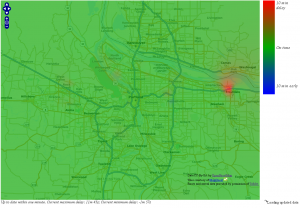
TriMet delays on the evening of 9/5/2011. They cleared up the large delay east of Portland not long after I took this screenshot.
GTFS-realtime was released a few weeks ago, and I thought the time was right to create a visualization of the data. This project is an OpenLayers web map (pictured at left, click for larger version) using OpenStreetMap data (and the MapQuest-OSM Tiles), which is overlayed with a raster showing areas that are currently being affected by delays. The raster is calculated based on the average delay for every stop in TriMet’s GTFSr feed at the time, and is rendered using Inverse Distance Weighting to calculate the approximate delay for every location based on the delays of the nearest stops. The IDW layer is rendered on the client side using fmark’s openlayers-pointvis plugin. The data is refreshed every 30 seconds from a Postgres database, which is kept in sync with TriMet’s servers using my aforementioned GTFSrDB project.
The raster shows green for no delays, red for delays up to 10 minutes (delays longer than 10 minutes are truncated to 10 minutes, otherwise the map looks flat in all but the worst-of-the-worst situations where vehicles are delayed 20 minutes or more. Of course, the map could be a lot more meaningful with a larger scale). Vehicles arriving up to 10 minutes early are shown in shades of blue. Delays tend to be more evident away from downtown, because they spread to cover a larger area because the stops are not as dense outside of downtown.
Using an IDW layer brings some perils in that data is shown for areas where there is no transit service (based on delays at the nearest bus stops) and that delays appear larger where stops are sparser (because there are fewer neighbors influencing a given cell), but it creates a nice, simple, easy to understand map. I also clamped the range for arrivals to +/- 10 minutes of schedule, because otherwise the map looks flat (i.e. all green) in all but the most extreme of circumstances. The tradeoff here is not being able to differentiate a 10 minute delay from a 30 minute delay, and also having a 1 minute delay begin to show red tinges, even though the vehicle is well within the margin of error for arrivals.
Another issue that I see with the data specifically is that it seems to tend not to provide updates for every stop, or even every timepoint, on a given trip. If an outbound trip is delayed 15 minutes downtown, it probably isn’t going to make up all of that time by the time it reaches the end of the line.
I plan to investigate these issues and try to come up with a more accurate representation for this data as soon as possible. For now, this map should be viewed as more of a ‘proof of concept’ than anything else.
Unfortunately, I only have a screenshot to show, because I don’t have access to a server where I can host this. But the code is all in the demo/ folder of the GTFSrDB GitHub, and I’d be happy to assist if anyone wants to deploy this on their server (for TriMet or any other agency, although I don’t think BART would look so great thanks to the sparse stop spacing). There’s an HTML file and a JavaScript file for the UI, and a Python CGI script to fetch the data from the database. The database URL is hardcoded into the CGI script; it’s currently set up for Postgres. You’ll need to load the static GTFS data using GTFSDB to the database as well, to provide the location data for bus stops.