Mapping Real-Time Delays: Review
mattwigway
Some readers may have noticed that I’ve updated my last post several times in the last few days. After thinking about the algorithms I used, I realized there were some significant issues with them. I’ve explained them a certain amount in my updates to my previous post, but I’d like to expand on the issues a bit here.
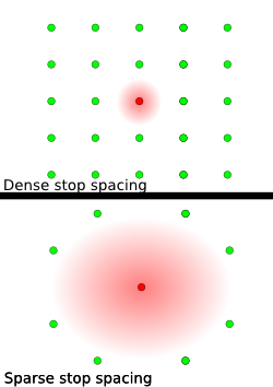
Using an Inverse Distance Weighting algorithm exaggerates delays where stops are sparse by allowing them to spread over larger areas; the graphic should make this clear; if the red dots are stops with delays, one in the city center and one in a suburb, it is clear that the delays will be magnified where stops are sparse (figure 1), because there are less stops around it.
Using an IDW layer also causes areas where there is no transit service to show data based on the nearest stops.
The data from TriMet (and, it seems, perhaps other GTFS-realtime producers as well) contains data for only one or two stops on a given trip, so delays only show near where the vehicle currently is. For instance, if a delayed bus is downtown right now, chances are it will remain delayed all the way to the end of its route. This causes the red ‘delayed’ spots to follow delayed buses, rather than showing all the areas where there are delays, or showing the origins of delays. This is especially true in the outer suburbs, where the average delay for a stop is often based on just one or two transit vehicles.