Below you will find pages that utilize the taxonomy term “Visualization”
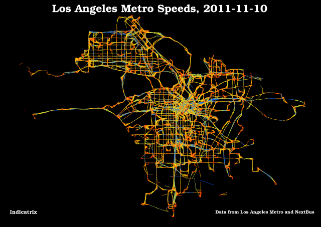
Making Transit Travel Speed Maps with Open Source GIS
Update 2011-11-12 8:21 -0800: I just posted a visualization I like better.

The Internet has been abuzz the past week regarding transit speed maps. It seems to have been spurred by a post on Bostongraphy, which was inspired by many of the amazing visualizations produced by Eric Fischer, especially this one. Indeed, this blog has gotten a fair bit of traffic itself, because Andy Woodruff of Bostonography used my avl2postgis project to retrieve the data.
Mapping Real-Time Delays: Review
Some readers may have noticed that I’ve updated my last post several times in the last few days. After thinking about the algorithms I used, I realized there were some significant issues with them. I’ve explained them a certain amount in my updates to my previous post, but I’d like to expand on the issues a bit here.
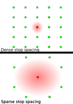
Using an Inverse Distance Weighting algorithm exaggerates delays where stops are sparse by allowing them to spread over larger areas; the graphic should make this clear; if the red dots are stops with delays, one in the city center and one in a suburb, it is clear that the delays will be magnified where stops are sparse (figure 1), because there are less stops around it.
