Visual Correlation Matrices
mattwigway
Correlation matrices show up often in papers and anywhere data is being analyzed. They are useful because they succinctly summarize the observed relationships between a set of variables; this also makes them very good for exploratory data analysis.
However, correlation matrices by themselves are still a bit difficult
to interpret, as they are simply numbers. For example, here is the
output of the R cor()
function. There’s a lot of useful information
there, but it’s still a bit difficult to interpret.
x1 x2 x3 x4 x5 x1 0.00000000 0.03297151 0.85017673 -0.69401590 0.5354154 x2 0.03297151 0.00000000 0.01985976 -0.02100622 0.1290689 x3 0.85017673 0.01985976 0.00000000 -0.61088013 0.5123067 x4 -0.69401590 -0.02100622 -0.61088013 0.00000000 -0.5308175 x5 0.53541535 0.12906890 0.51230666 -0.53081745 0.0000000
This data can also be displayed visually, in a color-coded matrix. Here is exactly the same data, displayed in visual form:
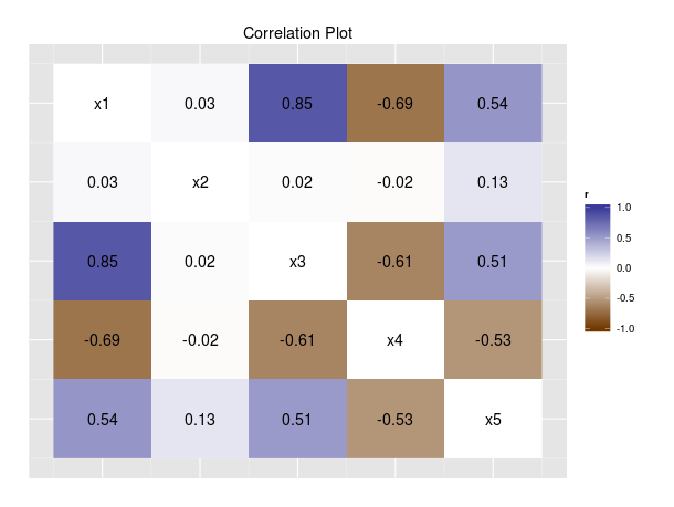
In particular, this improves on Tufte’s 6th and 7th principles of data graphics: encouraging visual comparisons and “reveal[ing] the data at several levels of detail” (page 13). It is much easier to compare the correlations of different variables visually than by doing mental arithmetic to compare the numbers in the correlation matrix. The correlation matrix also presents the data only at a high level of specificity. The visual display, on the other hand, uses colors to display the general patterns in the data, while still having the numbers to diplay the specific relationships.
This idea can be executed in many different data analysis
environments, but I use R. The R code
used to produce the above plot follows. Calling the function corplot
on a data frame will create and display the plot, and return the
correlation matrix.
# Draw visual correlation plots, http://www.indicatrix.org/2014/02/22/visual-correlation-matrices/ | |
# Copyright (C) 2014 Matthew Wigginton Conway. | |
# Licensed under the Apache License, Version 2.0 (the "License"); | |
# you may not use this file except in compliance with the License. | |
# You may obtain a copy of the License at | |
# http://www.apache.org/licenses/LICENSE-2.0 | |
# Unless required by applicable law or agreed to in writing, software | |
# distributed under the License is distributed on an "AS IS" BASIS, | |
# WITHOUT WARRANTIES OR CONDITIONS OF ANY KIND, either express or implied. | |
# See the License for the specific language governing permissions and | |
# limitations under the License. | |
library(ggplot2) | |
library(scales) | |
corplot <- function(data, title=NA) { | |
# We save two copies because we'll be monkeying with the cors matrix to make the colors | |
# right | |
cors <- ret <- cor(data) | |
# Principal diagonal: show white so text is visible | |
diag(cors) <- 0 | |
label <- matrix(as.character(round(cors, 2)), nrow(cors), ncol(cors)) | |
diag(label) <- names(data) | |
df <- data.frame(x=rep(1:ncol(cors), nrow(cors)), y=-sort(rep(1:nrow(cors), ncol(cors))), | |
r=as.vector(cors), label=as.vector(label)) | |
p <- ggplot(df) | |
# default color scheme inspired by color scheme in The Elements of Statistical Learning, by | |
# Hastie, Tibshirani and Friedman. | |
p <- p + scale_fill_gradient2(lim=c(-1, 1), low=muted('orange'), high=muted('blue')) + | |
geom_raster(mapping=aes(x, y, fill=r)) + | |
geom_text(mapping=aes(x, y, label=label)) + | |
theme(axis.title=element_blank(), axis.text=element_blank(), | |
axis.line=element_blank(), axis.ticks=element_blank(), | |
panel.border=element_blank()) | |
if (!is.na(title)) { | |
p <- p + ggtitle(title) | |
} | |
benchplot(p) | |
return(cors) | |
} |