Another LA Metro Visualization
mattwigway
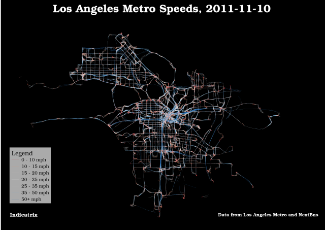
Here’s another visualization of the data used in the previous post; I made the lines a lot finer, so the noise is less visible. It’s easier than ever to see the Silver Line. I classed the data manually this time.
